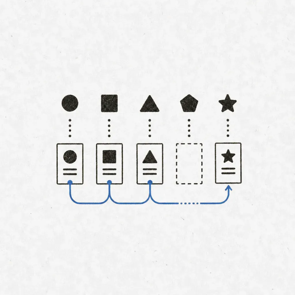
“Booking” is a feature. It is not a screen. Somewhere between the two sit a calendar view, a confirmation, an email, a reschedule link, and a page for the moment the slot was taken thirty seconds ago. A feature list never names any of those — and they are most of the build.
Why the three lists always end up disagreeing
Most plans hold features, pages and flows as three documents written at three different times. Within a week they contradict each other: the feature list gains something the pages never got, the flows describe a screen that was renamed, and nobody notices until someone builds from the wrong one.
They drift because they are not three subjects. They are three views of one system. A feature exists on a page. A page sits inside a flow. A flow crosses several features. Change any one and the other two are already wrong. A plan that names screens without ever writing the path between them has skipped precisely this, which is what an AI-written plan did when I scored one against twelve questions.
So write them together, in one pass, in one place. This is section four of the planning method, and it comes after the feature list on purpose — you cannot derive screens from features you have not agreed on yet.
A feature list is what the product does. A flow is what a person does. Only one of them can be tested.
Deriving pages from features, not from imagination
The mistake is opening a design tool and inventing screens. The pages are already implied by the features — the job is to extract them, not to think them up.
Take each feature and ask three questions in order.
- Where does someone do this?That is a page. Name it as a route, not as a concept:
/book/[coach], not “booking experience”. - Where do they see the result?Often a different page, and often the one people forget. Doing a thing and confirming it happened are two screens.
- Where does someone change or undo it?The edit path. This is where most of the unplanned work hides, because undoing is rarely as simple as doing.
Six features answered honestly usually produce eight to twelve routes. If your page list is shorter than your feature list, you have not extracted it yet — you have summarised it.
What a flow has to contain to be worth writing
Two or three flows matter. Not every path — the ones that carry the promise. For most products that is: the thing the customer came to do, the thing that goes wrong most often, and the thing the operator does daily.
Write them as prose, in sentences, not as boxes. A diagram lets you draw an arrow between two states without saying what happens in between; a sentence does not. And each flow needs four things that lists of screens never carry:
- Where they arrive from. An email link, a search result, a bookmark. The entry decides what you can assume they already know — and whether they are even signed in.
- What they have to decide. Every choice is a place to stall. Naming them shows where a default would be kinder than a question.
- What confirms it worked. Not a toast. The state they can come back to tomorrow and still see.
- What happens when it fails. Not an error page — the specific failure. Payment declined is not the same as slot taken, and they need different screens.
Where the flow leaves your product
The valuable part of writing flows in prose is that it forces you to name the moments the flow crosses out of your software and into something you do not control.
A payment goes to a provider and comes back — or does not come back, and you have a pending state you never designed. An email leaves and arrives whenever it arrives. A calendar file lands in an app that formats it its own way. A policy check answers with a rule someone wrote in another section.
Every crossing is a place where the flow can stop halfway, and a halfway state is a screen. That is the connection people miss: crossings generate pages. They are also the decisions most likely to touch everything else, which is why the dependency step comes right after this one — the crossings you find here are its raw material, and what breaks later usually crosses here first.
A useful test
Read the flow out loud and stop at every “and then it…”If the sentence continues with something your code does not do — sends, charges, checks, notifies — that is a crossing. Write down what the user sees while it is happening, and what they see if it never finishes.
The screens nobody puts on the list
Four states exist for almost every page and appear in almost no plan. They are not polish. They are the first thing a real user meets and the last thing anyone budgets for.
| State | When it is the first thing they see |
|---|---|
| Empty | Day one, every single user. The most-seen screen in the product and usually the least designed. |
| Partial | Something loaded, something did not. Common the moment a crossing is involved. |
| Not allowed | Wrong account, expired link, cancelled already. Every shared link eventually lands here. |
| Too much | The list that was fine at ten rows and unusable at four hundred. |
You do not have to design all four now. You do have to list them, because each one is work, and work that is not on the list is what turns a two-week build into a five-week one.
A worked example, end to end
Take a booking tool for independent coaches. The feature is “clients book a session.” Here is what that one line actually contains once it is extracted properly.
One feature, extracted
- Pages: public booking page, slot picker, payment step, confirmation, the coach's today view, and the reschedule page reached from an email link.
- Flow: arrives from a link the coach shared → picks a slot shown in their own timezone → pays → both sides get a confirmation with a calendar file.
- Crossings: the payment provider, the email, the calendar file. Three places the flow can stop halfway.
- Failure screens: slot taken while they were deciding, payment declined, email never arrived, link opened after the session already happened.
- States: a coach with no availability set yet, a client list that is empty, a booking page for a coach who has paused.
One feature. Six pages, four failure screens, three crossings. None of it is unreasonable and none of it was visible in the words “clients book a session.”
That expansion is the point of doing this before the build rather than during it. Found now, it is a list you can order and cut. Found in week three, it is the reason the estimate was wrong — and the thing you cut under pressure is usually the empty state, which is the screen every new user sees first.
Reader response
Was this field note useful?
Next in the path
Pages and flows are section four. Here is the whole document.
See a complete blueprintField notes by email
Thanks, you're on the list. ✓
Email signup did not go through. Please try again.
A short note when there is something worth sharing. No spam.